Knowing more design content suitable for digital printing can reduce difficulties in printing to avoid errors. Generally, files used for digital printing should be more flexible and simple, without the need for very accurate registration, color matching, or accurate double-sided registration. Contact your digital printing factory a lot and they will give you advice on special designs, images and software settings.
Large format design
There is no need to always limit the design to standard format sizes. Web digital printing presses, such as Agfa's Chromapress, can print larger formats because they use continuous paper tape. You can print posters and flags up to 11.8 meters in length.
Make black richer
When printing black (especially overprinting text), black is usually mixed with a certain proportion of other three colors to make black richer. The rich black prevents the underlying color from revealing. The ratio of the other three colors varies with different printing presses, paper types, background colors, and the overall effect you want. (HOHO Note: Generally do not add 4 colors, mainly add 20% blue, black will look better)
Gradient
To prevent uneven streaks in color mixing or gradients, the gradient is usually controlled to 1 to 4 inches. Use lighter colors, the gradient should not exceed 50%. Using image processing software to add noise to the gradient can also help reduce unevenness.
image
Some printing systems provide a selection of screening technologies that can improve the quality of halftone images. You can ask the operator of the printing plant for samples printed under different screen and color adjustment settings to choose the most suitable setting for you.
High key and dark key
The optimal critical value of the high-key part and the dark-key part varies with different printing machines. Generally speaking, the highlight part cannot be lower than 5% C, 3% M and Y; the dark part cannot be higher than 85% C, 75% M and Y.
Field and gradient
Large areas of solid or flat screens will show streaks on printers that use toner and should be avoided. This is caused by the uneven distribution of charging charge or toner particles. Because thicker paper has poorer affinity for electric charge than thinner paper, the above phenomenon is more severe for thick paper. To avoid this, use a lighter color or shading.
Folded hands
For printing presses that use dry toner, avoid placing the dark part on the paper fold. If the high temperature is not fixed properly, the toner at the paper fold will crack, leaving a tortoise crack. Therefore, if possible, print lighter colors or leave blanks at the creases. In addition, to prevent rough creases, make sure that the folded hands are aligned along the paper texture.
Cutting and binding
You need to know clearly that the printing machine adapts to the size of the paper, leaving as much bleeding and cutting edges as possible, so as to facilitate cutting, especially when it is on a web printing machine or when binding with a sheet, when you use saddle stitch binding to compensate The middle page is squeezed out, and "binding fine adjustment" must be used during imposition to adjust the position of each page of content. (HOHO Note: This is a very important part, everyone must pay attention)
software
When using the path cut function in Adobe Photoshop, use smoothness of 5 or 6 for general images. For particularly small images, use smoothness 1 or 2 when creating the path, and then set the smoothness to 5 when saving the path . In addition, 1-bitTiff may have problems when printing, please convert it to grayscale Tiff or bitmap PICT format.
In IIIustrator, please convert the text font to a path.
In QuarkXPress, to avoid rotating the graphics in the graphics frame separately, you should rotate the entire graphics frame.
personalize
If you want to change the image or text for personal printing, you must make sure that the replacement element fits in the same position and fits in a variable position. Each page requires at least two proofs containing different substitute elements, so that you can ensure that the different elements are correctly placed in the same position.
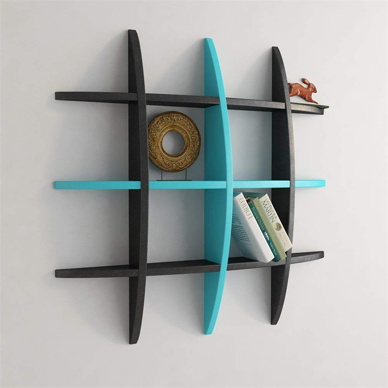
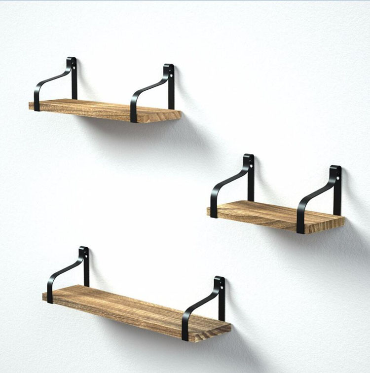
A floating shelf is a form of shelf with its wall fixings hidden within the shelf board, with no visible supporting brackets. It can be supported on hidden rods or bars that have been attached to studs. A thick floating shelf may be made of a hollow-core shelf glued to a cleat.

A floating shelf may have two or more channels open from the back towards, but without reaching, the front, into which slide fasteners attached to the wall, typically held in place by screws inserted through the bottom of the shelf.
For typical floating shelf supports, a supplier suggests that floating brackets with a diameter of 12mm can support a shelf at least 22mm thick loaded with 20kg, and 18mm brackets can support 30kg on a 28mm shelf.

This description is in reference to one particular type of floating shelf support, others options are available. Also not to be confused with corner shelves, which would require entirely different supports to make them "float".
Floating shelves are a good fit for a contemporary minimalist style interior.They can be used to expand storage space, atop a radiator to double as storage, or inside a hallway to double as a console table.
Wall Mounted Floating Shelf,Wall Mount Shelf,Wall Floating Shelves,Wood Wall-mounted Shelf,Wall Mount Decorative Shelf,Wall Mount Shelf Set,Wall Storage Shelf
Jinan Tri-Tiger Technology Development Co., Ltd , https://www.tritigerwooden.com