So, what aspects should the skills of mastering packaging design begin with? Here are three main points: First, the grasp of color techniques; Second, the grasp of composition techniques; Third, the grasp of cultural connotation.
First, the grasp of color skills
Color techniques should be noted from the following points: First, the relationship between color and packaging; and second, the contrast between color and color. These two points are the key to the use of color.
(a) The care of color and packaging
Then, where should we talk about the relationship between color and packaging? Mainly through the external packaging color can reveal or reflect the inner packaging items. It allows people to basically perceive or think of what the inner package is. For this question, I have mentioned it many times in the past articles, but if we can come to the store to get a look at the goods, many products do not reflect this relationship. So that consumers can not think of what to pack things from the table and inside. Of course, there is no positive sales promotion for the sales of products. The normal external packaging color should grasp this same characteristic to varying degrees;
(1) From the industry's advancement, the normal color of food is expressed in its main colors of yellow and pink to give people a sense of warmth and intimacy. Of course, many of them use green tea, and there are many beverages, green and blue, and there are a lot of reds for liquors and pastries, and a lot of rose color for children's foods. Daily cosmetics use normal colors. The main colors are mostly rosy, pink, light green, light blue, dark brown, to highlight the warm and elegant feeling, clothing and shoes and hats are mostly dark green, dark blue, brown or gray, to highlight the calm Heavy and elegant beauty.
From the aspect of performance characteristics, in the case of foods alone, cakes and pastries use golden, yellow and light yellow to give people the impression of scenting on people; teas, beer and other beverages use red or green types, symbolizing the richness and aroma of tea; Tomato juice and apple juice are often red, and the concentration indicates the nature of the item. Although some packages do not use the same colors as the ones mentioned in the main tone, but look closely if the design of the package is written by the self-owner's hand, then, in its outer packaging, There must be a symbolic color block, color point, color line, or focused content highlighted in that color. This should be everyone's proud job. Some clothing packaging and some cosmetic packaging, and even some wine packaging can find a lot of such examples.
(B) the contrast between color and color
Besides, the contrast between color and color. This is the easiest thing to do in many commodity packaging but it is very difficult to grasp. In the design from the master, the wound effect of the package is snow white, otherwise, is the lower Riba. In Chinese calligraphy and painting, such a saying is often popular. It is airtight and sparse. In fact, it is a kind of contrast relationship. In the packaging design, this contrast is very obvious and very common. These so-called comparisons generally have the following contrasts: the contrast between the use of colors, the contrast of the use of colors, the point-to-point ratio of the use of colors, the simplification of the use of colors, the contrast between the use of colors and the contrast of colors, and the contrast of colors. Contrast and so on.
(1) The contrast of the color used. This is the most frequently used color in the current packaging design, and it is the most widely used. It is very common in many graphic designs (such as posters, hanging scrolls, or dressmaking classes). The so-called contrast between shades and depths should mean that the design uses two colors, shades of color, to subtly appear on one screen at the same time, resulting in a more coordinated perspective. It is usually used as a light-colored base with a large area, on which a dark composition, such as a light yellow base, is used to compose a composition in brown, or a yellowish or white pattern is used in a brown color patch; With a light green bottom; dark green composition; pink bottom; large red composition; light gray bottom; soap black composition and so on. These are all shades of contrast in color. In this form, we can design packaging on some cosmetic packaging or on the packaging of some western wines, especially Western wine packaging. Chinese Changyu wines and Shuanghui's sausage sausages as well as Xijie's meat packaging are mostly expressed in this form. This form of packaging is also common in Japan and South Korea. Its visual effects are clear, simple, gentle, and elegant.
(2) The use of color for contrast (or contrast) is one of the important methods of reproduction. This kind of contrast is often accompanied by a deep and solemn motif on a light and elegant background, or in a heavy, solemn motif (mostly with color patches). The theme and name of the light and elegant packaging, as well as trademarks or slogans. In turn, it also uses a large area of ​​deep dignified pigments. Another light and elegant tone or focus on a certain color block or fully decorate some patterns. In this light contrast, the general pigments have a harmonized color contrast and a cool and warm color contrast. The methods of harmonizing the color contrasts are often pale green to dark green; light yellow to deep coffee; pink to red, etc., while the contrast between cold and warm colors is mostly Black and white, red and blue and so on.
(3) The point-to-point ratio (or size contrast) of color use contrasts mainly in the design process of a packaging screen, using the contrast of colors from a center or a focal point to the overall screen, ie, a small range and a large range. The contrast between the pictures. In daily life, especially washing cosmetics, we can see a clean box of products on the whole area of ​​what is not, on the middle of a very focused and then appear a very obvious small box of heavy colors (or Elliptical or small round) and then from this small box of screens, the theme of the brand and name of the contents of the package is expressed. This is a combination of point and surface, but also a contrast between large and small, and occasionally from point to point. And the gradual transition of the contrast.
(4) Contrast of simplification of color use. We can see the uniform 100 instant noodles, the bottom half of each bag is a physical pattern of every kind of instant noodles, and at the top of the screen it is the whole clean, big green red color, and then stands out very conspicuously.†100 words, look at the cover of the "Packaging World" magazine's 66 issue (also called the book's packaging). With a large area of ​​real photos of straw, it is very complicated and even packed into the world. However, the center of the screen shows a clean and blank space. In it, it states that "The magazine will expand and expand in 2000" and "Welcome to your local post office." It is so simple and simple, but it ingeniously puts the emphasis on the magazine's most important thoughts. The author also saw a dumpling bag and a seasoning bag in the store. The whole picture was made of green black and yellow pigments and intertwined on one screen. Also want to express the name, but also want to express the foil pattern. As a result, because of the large area of ​​the complicated design, there is no actual meaning of the dark lining pattern, and all the above-mentioned descriptions of the main body are diluted, drowned, resulting in this kind of packaging. People's psychological depression and feeling of irritability naturally affect sales.
(5) The contrast of lust in color use is mainly to emphasize its elegance by highlighting it. This kind of vulgar expression is carried out with the "dirty" and disorder of color (in fact, it is originality. Some Western oil paintings are very concerned about this type of expression - that is, modern abstract art). This kind of composition is either a symbolic disclosure of the theme or a service for the theme of "Lotus." To make it a little red in the bush. For example, on a packaging screen, it looks like a bunch of random colors or thrown on it. Then quietly side by side or in the finely articulated theme. This is a very interesting thing. In addition to packaging, even book bindings, advertisements, posters on posters, and casual columns on TV have all been tried.
(6) Contrast of contrast in color use. This contrast contrast is essentially the contrast effect formed by different pigments themselves. This contrast effect is generally expressed in the following ways: light and dark contrast (or contrast between yin and yang), like China's light map; contrast between warm and cold, such as red and blue; contrast between movement and sound, such as calm and calm background and lively jumping The contrast of the pattern text: the contrast of lightness, such as the contrast between deep pigment and light pigment.
The above comparison of these colors is entirely due to a way that a pattern needs to be represented by the contrast of different colors, but this pigment is also an indispensable object constituting the entire packaging pattern element, and some patterns are even different. Ingenious combination of pigments. Therefore, in the process of studying packaging design, if you do not pay attention to grasp the contrast between color and color, you can't talk about designing a good packaging pattern.
Second, the grasp of composition skills
Just like the grasp of color techniques, the compositional techniques are more varied, and the relationship between the two is interdependent and mutually expressive. But color is the foundation, and composition is the process and the ultimate goal. So composition is important. In the process, in addition to grasping certain skills, we must pay attention to its visual effects. The effect is the ultimate goal.
(A) grasp of the composition skills
Composition skills, in addition to contrasting skills in the use of color need to learn to master, but also need to consider several comparative relationships. Such as the composition of the thickness of the comparison techniques, the composition of the skills of the far and close comparison, the composition of the contrast of the vegetable skills, static contrast of the composition skills, composition of Chinese and Western skills contrast. Comparing ancient and modern composition techniques.
(1) Thickness comparison of composition techniques: The so-called “thickness contrast†refers to the colors used in the composition process and the style formed by the color composition pattern. In the calligraphy and painting work, we know that there is a work brush and freehand brushwork Or the brushwork and freehand brushwork appear on a single screen (like the Chinese painting master Qi Baishi's paintings of Chinese cabbage and Chinese wolfberry), and this style is often used in the packaging composition. Some contrasts between the main pattern and the foil pattern contrast with the contrast between the main pattern and the foil pattern; some are the contrast between the center pattern and the background pattern; some are rough and sweeping, and the other side is exquisitely fine and delicate; some use the wild grass calligraphy to replace the pattern. This can be seen anywhere and anytime in some alcoholic and food packaging. Such as the missed brand dumplings and Ploen shampoo shampoo is like this.
(2) Comparing the distance between the composition techniques and landscape paintings, the landscape of the landscape paintings of Chinese paintings is studied in the medium and long-range perspectives. In the design of the packaging drawings, in the design of the packaging drawings, the same principles should be used for the composition layers of several kinds of screens. The so-called near, is the most eye-catching part of a picture, also called the first visual impact, this most eye-catching is also the most important content to be expressed in the packaging pattern, such as the earliest used instant noodles packaging, the first Into the eyes of people is the Shuanghui trademark in the blank background and the large Shuanghui word (ie close shot) of the white variety in the background of dark red squares, which in turn is the main character of the smaller “Fried Beef Noodlesâ€. (It should be said that the second line of sight, also called the middle view), is again the product picture (also called the third line of sight, bounded by the middle view) that expresses the contents of the package. Then there is an auxiliary corporate mascot slogan. Performance clarification, corporate logos, etc. This obvious sense of hierarchy is also called the three-step visual principle. It shows the most to be expressed at the same time as people take a look at the habit of viewing a still-still picture from top to bottom and from right to left. The theme section. As a designer, at the beginning of the creation of the painting, the production should first understand the theme of the appeal and create a shining star.
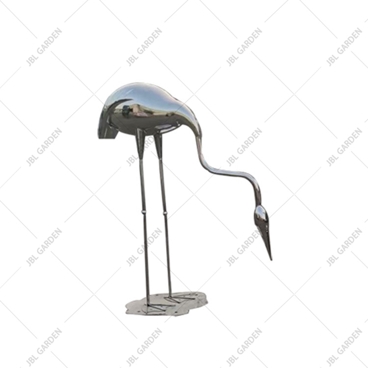
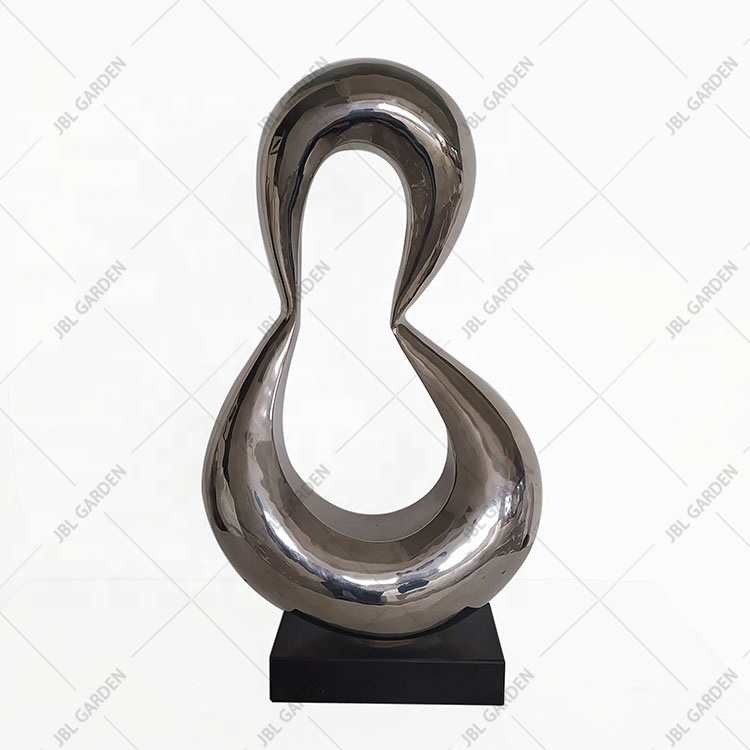
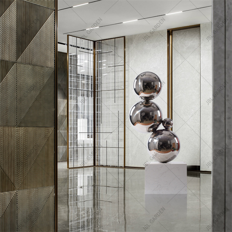
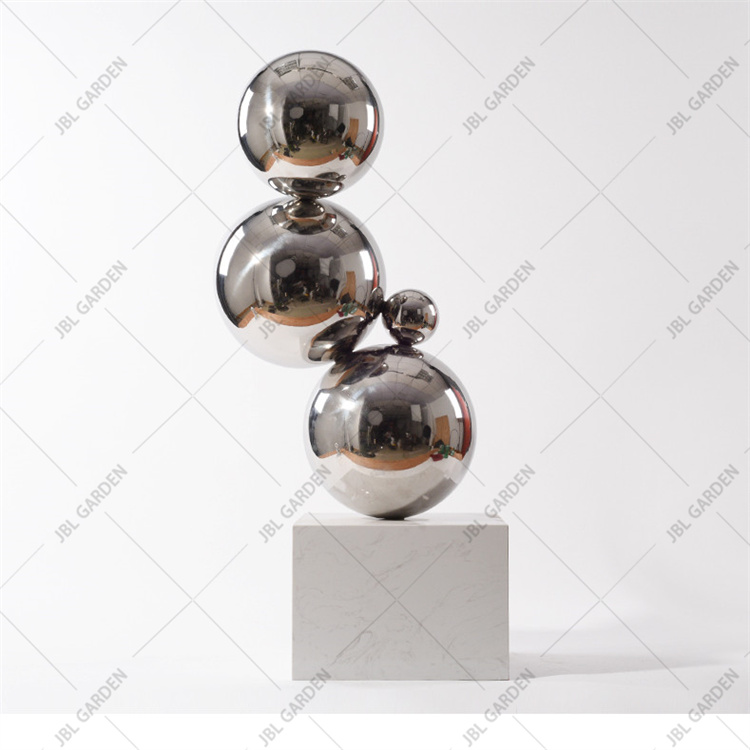
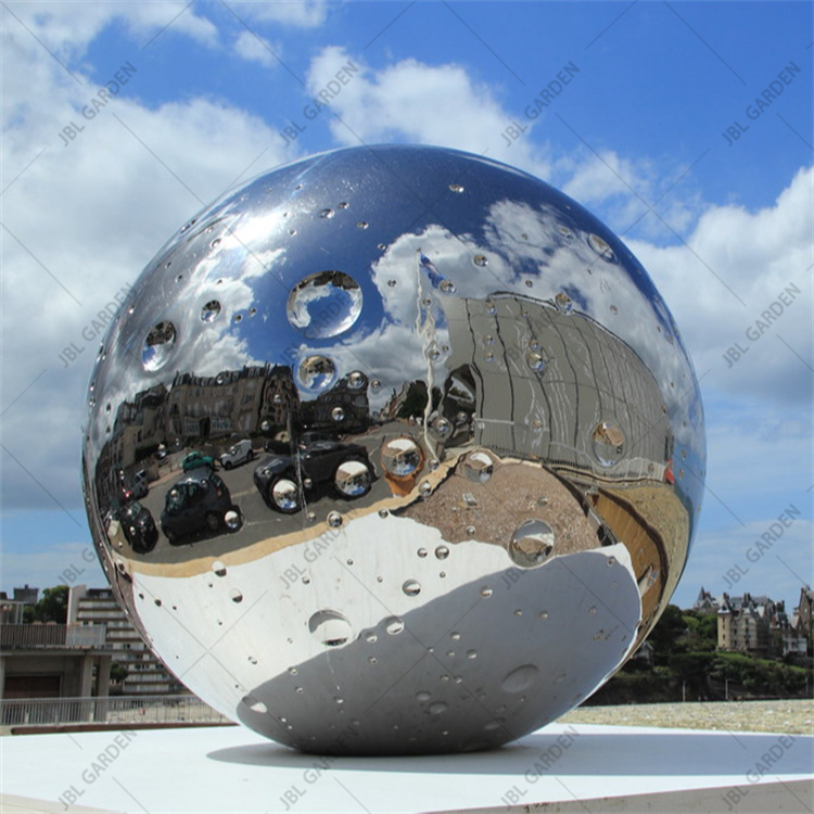
Stainless steel large sculpture now basically occupies the mainstream, because stainless steel material has good characteristics, has been recognized by most of the urban landscape, but also has become an indispensable scenery inside the sculpture. Now there are different materials of sculpture, stone carving, copper carving, stainless Steel Sculpture, glass steel sculpture, weathering steel sculpture, but with some high-grade environment and setting, are the main choice of stainless steel sculpture material! Stainless steel sculpture material has good corrosion resistance, not afraid of air water. Steam, as well as the wind and sun environment, which is also a very important factor of stainless steel sculpture. Second, the color of stainless steel sculpture is also relatively fresh, but also according to the demand of spraying, modeling out of a more advanced and better sense of art, for the environment and the city will increase beautiful scenery.
| Name | Decorative Stainless Steel Sculptures |
| Material | Stainless steel |
| Size | Customized |
| Weight | 100KG |
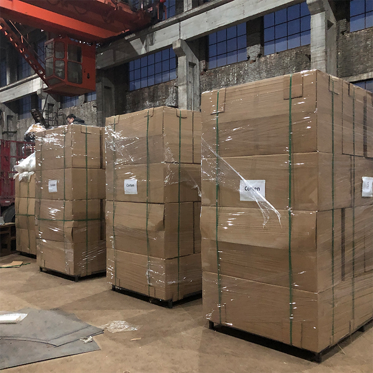
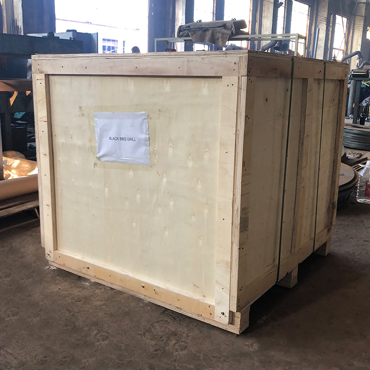
| Packing | wooden |
Packing
Packing will by pallet/carton/ wooden box,according to different demand.
Stainless Steel Sculpture Stainless Steel Sculpture,Stainless Steel Artwork,Stainless Steel Statue,Stainless Steel Yard Art
Henan Jinbailai Industrial Co.,Ltd , https://www.jblfirepits.com