Affected by traditional editorial thinking, the layout of electronic publications is often overlooked. In fact, the importance of layout design of electronic publications is greater than that of traditional books and magazines. Many creative ideas can only be fully reflected in proper layout arrangements. For example, the clarity and easiness of interactive works largely depend on the rational layout of the layout, the division of functional areas, the placement of small buttons, the color, and the convex and concave areas, which may affect readers' reading and use. Must not be arbitrarily arranged, according to the principles of aesthetics and visual psychology to summarize some basic design techniques for reference:
1 screen layout features
The physical characteristics of the screen and the changes in the visual characteristics of human eyes determine that the screen reading has different characteristics compared with the traditional reading, and thus the layout design has different requirements. Paper reading has a long history, the color of paper and ink, the matching of font sizes, and even the influence of light have been thoroughly studied. For a long time, the screen has been used for viewing rather than reading. Therefore, the study on the adaptability of reading is relatively weak. The author believes that at least the following features should be taken into account when designing a screen layout.
1.1 Size and Resolution Limits
The rectangular size of the computer screen limits the display of the screen, thus affecting the selection of elements such as font size and the storage of large graphics and tables. For example, if the font size is too large, the page is frequently distracted, and if not, it is difficult to recognize the difficulty. Instead of using “bleeding†or double-page layouts to arrange large graphics or tables, you can use scrolling, layered or hypertext links. method. The fineness of the picture is no longer determined by the producer alone. And mainly depends on the physical characteristics of the user's screen and display software features, so the design does not need blind pursuit of high resolution.
1.2 The use of color
The range of color of screen phosphors is much larger than that of paper inks. The ability of the human eye to distinguish color (approximately thousands of species) is also significantly better than the resolution of gray levels (about 100+ levels). With the ease of use and modification, it is natural to use a large amount of color in electronic publications. Things. Different colors have different visual space effects (such as the warm sense of advancement, expansion, and excitement). Reasonable configurations can show magical artistic appeal. Play a variety of functions such as content differentiation, theme rendering, atmosphere contrasting, and adding three-dimensional effects. Avoid using too many colors too much and too much chaos, too much brightness, otherwise it will interfere with the effective absorption of information required by the line of sight.
1.3 layout of new elements and new forms of joining
Apart from the conventional layout elements such as text tables, graphic images and lace shading, the two new elements that should not be neglected have been added: light and tone. Although they do not have substantive content, they guide the line of sight, highlight the main body, and display Texture differences, rendering atmosphere and maintaining the balance of the picture play an important role.
Animated figures, flashing symbols, etc. are new manifestations of layout elements. When used properly, it can be very active, prompting, and attracting readers' attention. However, excessive use can distract attention, disturb thinking, and even cause dazzling feelings. It must be avoided.
The placement of the eyebrows, footnotes, and pages can all be designed in novel ways.
2 basic skills of screen layout design
Layout art has no strict laws nor universal models. Only by continuous study and study can we accumulate rich experiences, integrate various types of knowledge, and seek perfect correspondence between the forms of information expression and readers' acceptance of the psychology.
The layout of the electronic publication is divided into dynamic static and dynamic. The dynamics are mainly reflected in the transformation of the screen. There are changes in the commonly used methods, such as changing, sweeping, encircling, strobing, and so on. The motion, emotion, rhythm, and sound are required to pass through. Reasonable division and grouping enable readers to feel the existence of paragraphs, and feel that the performance process is complete, consistent and smooth. Static layout design has the same features as traditional books and periodicals, but due to the aforementioned features, we need further in-depth research.
The basic principles of layout design can be summarized as balanced and diverse unity. The purpose is to make the picture clear and easy, beautiful, attractive, and in line with people's psychological habits, the application system must also take into account the ease of operation.
2.1 Equilibrium
Balance is the natural psychological requirement that people form over a long period of time. Picture balance refers to the principle similar to leverage. With the center of the picture as the fulcrum, the weight of the visual image of the upper and lower left and right sides (essentially the conspicuous degree in the picture) is generally in a relatively balanced state. The viewer has a stable feeling. The weight of the image generally varies according to its type, size, color, movement, and other properties. For example, people are heavier than animals, animals are heavier than plants, brighter than gray, heavy textures are more delicate than delicate ones.
Obviously, symmetry is a special case of equilibrium, and it is the easiest to grasp. It is suitable for the presentation of solemn and serious topics, but it is often prone to be dull, lacks fun, and should not be used in layout design. It is better to break symmetry but satisfy people's psychology. The relative balance of visual weight and value required by senses and life experiences.
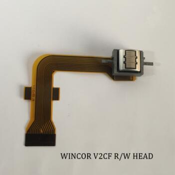
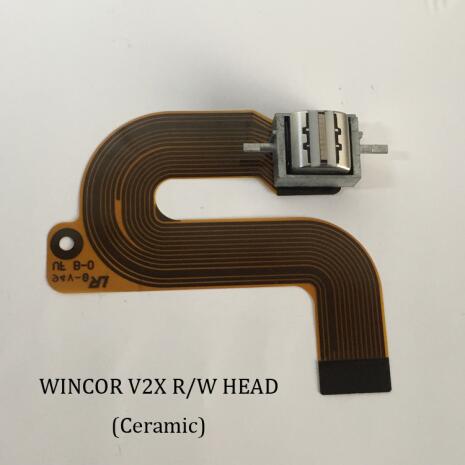
ATM Parts of Wincor Nixdorf
Wincor Nixdorf INTERNATIONALGMB is an international it leader in retail and banking. Heinznixdorf, from Germany, was full of legends and passions at the beginning of its founding. The founder of our proud company, the originator of the computer industry: Heinznixdorf founded the company in 1952 and quickly developed it into the fourth largest computer company in Europe. After more than half a century of expansion, today's Wincor Nixdorf has been an international group with branches in more than more than 70 countries and regions and in 28 countries. In the retail arena, Wincor Nixdorf provides retailers with software and hardware solutions for the entire value chain: from stores to Headquarters, from POS systems, electronic cash and self-help scans to the entire business solution supply, and in the enterprise resource planning, supply chain management, category management, customer relationship management, business intelligence and multi-channel business, and other aspects, including from the strategy, process to the implementation of a full range of consulting services.


Wincor Card Reader,Wincor Rubber Keyboard,Wincor Atm V2X Card Reader, Wincor Atm Parts
Taishan Wenshin Electronic Co., Ltd. , http://www.ws-posprinterpart.com